
A thoughtfully arranged picture on a living room wall can transform an ordinary space into something more personal, more expressive. Whether it's a family photo, a striking art print, or a sentimental keepsake, how and where you hang it speaks volumes. Yet picture placement isn't just about filling a blank wall. It involves paying attention to proportion, symmetry, light, and the overall flow of the room. The process starts before a single nail is hammered in — beginning with frame selection and ending with a sense of visual balance that feels effortless but deliberate.

Picking the Right Frame for the Right Feel
The frame is more than a border. It defines how an image connects with its surroundings and affects how viewers perceive what’s inside. When choosing frames, consider the material and finish as much as the color — matte black adds contrast, while natural wood brings warmth. A glossy gold might echo the elegance of a chandelier or antique mirror nearby. Matching the frame to the room’s existing elements can make a display feel curated instead of chaotic. This doesn’t mean everything needs to match perfectly, but a sense of cohesion helps. If you’re looking for a simple way to try out different frame looks or create a unified gallery wall without fuss, Easy Frame offers custom solutions that take the guesswork out of sizing and style — right from your screen to your wall. It’s a useful way to test out combinations and settle on what complements your space best before making any holes in the plaster.
Considering Eye Level and Seating Position
Eye level isn’t a fixed number. In a gallery, the average hangs around 57–60 inches from the floor to the center of the artwork. But living rooms often involve seated viewing. A piece that looks right when standing may feel awkward or towering when you’re on the couch. Let the furniture guide the positioning.
If you’re placing art above a sofa or console, leave around six to eight inches between the top of the furniture and the bottom of the frame. This connects the wall art with the item beneath it, creating a sense of relationship. Keep the center of the image roughly at seated eye level — usually just under five feet from the floor — to make it feel grounded and connected to the room’s purpose.
Balancing Proportions and Wall Space
A small picture floating in the middle of a large wall can look lonely, no matter how beautiful it is. On the other hand, a massive frame crammed into a narrow spot feels intrusive. The scale of your art should respond to the available wall space. For wide walls, consider larger works or groupings that span horizontally. For narrow vertical strips, tall or stacked arrangements work better.
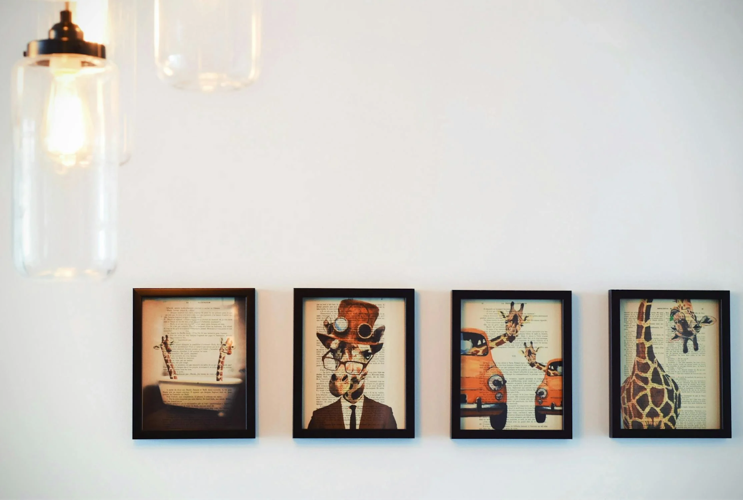
When working with a large blank area, aim for your art to cover about two-thirds to three-quarters of the width of the wall or the furniture it’s above. This gives it presence without overwhelming. Groupings of smaller pictures should be treated as a single unit, both in their visual weight and spacing. Uniform gaps between them — usually one and a half to three inches — help keep them from feeling cluttered.

Using Light and Shadow to Your Advantage
Natural light plays a major role in how art appears throughout the day. A picture that glows in the morning might seem flat by evening. Take note of how sunlight enters the room. While direct light can highlight texture, it may also cause glare or fading over time, especially with photographs or delicate pieces.
Positioning art near a window — but not directly in its path — lets light bring the picture to life without overexposure. At night, lighting from sconces, picture lights, or overhead fixtures can spotlight the work and create the mood. Be wary of placing highly reflective glass across from strong light sources. This can turn your artwork into a mirror, showing reflections rather than the piece itself.
Creating a Gallery Wall that Flows
A gallery wall isn't just a random cluster of pictures. It takes planning to feel effortless. Start by laying out the arrangement on the floor before committing it to the wall. Trace each frame onto craft paper, tape the outlines to the wall, and adjust until the balance feels right.
Try mixing frame sizes but keep one visual thread running through — maybe it’s a shared color palette, subject matter, or consistent spacing. Align either the tops, centers, or bottoms of the frames to anchor the collection and avoid a scattered look. When done right, a gallery wall can feel personal without looking chaotic. It draws the eye across the room, inviting closer inspection.
Letting the Room's Purpose Influence Placement
Every room has its rhythm, and understanding the role each corner plays can guide where — and what—kind of art belongs. A living room isn’t just one continuous space; it’s often divided by use. Some areas are meant for conversation and gathering, others for solitude or rest. The wall above a fireplace, for example, tends to attract attention naturally and can serve as the visual anchor of the entire room. This spot deserves a piece with presence — maybe a large, bold canvas or a framed print that feels intentional, something that draws the eye the moment someone walks in. It doesn’t have to shout, but it should hold the space with confidence.
Other areas call for a more subtle touch. Think of a reading nook tucked near a window, or a quiet corner by the bookshelves — spaces that aren’t always in the spotlight but are deeply lived in. Here, a smaller piece, hung at a more intimate height, can encourage pause. A black and white photograph or a piece with soft tones can complement the stillness of the setting, creating a feeling of calm without distraction. Placement at a slightly lower level makes the art feel approachable, something that invites you in without demanding attention.
Hanging art in a living room isn’t just about decoration — it’s about placement, presence, and personality. From selecting the right frame to deciding how high to hang it, every choice contributes to how the space feels and functions. Consider the room's light, its architecture, and the ways people move through it. When the frames, proportions, and positioning all work together, the room starts to feel more complete, not because it’s filled, but because it reflects the people who live in it.

(0) comments
We welcome your comments
Log In
Post a comment as Guest
Keep it Clean. Please avoid obscene, vulgar, lewd, racist or sexually-oriented language.
PLEASE TURN OFF YOUR CAPS LOCK.
Don't Threaten. Threats of harming another person will not be tolerated.
Be Truthful. Don't knowingly lie about anyone or anything.
Be Nice. No racism, sexism or any sort of -ism that is degrading to another person.
Be Proactive. Use the 'Report' link on each comment to let us know of abusive posts.
Share with Us. We'd love to hear eyewitness accounts, the history behind an article.