

You've bought the art. You love it. Maybe it was a splurge, maybe a lucky find at a car boot sale. Either way, it's sitting there propped against your wall, and you're staring at it like it's some sort of puzzle you didn't sign up for. How do you actually hang this thing so it looks intentional? So it doesn't scream "I tried but failed"?
Displaying art isn't rocket science, but it's not quite as simple as banging a nail into plaster & hoping for the best. There's a bit of finesse involved. Some thought. And honestly, a fair amount of trial and error if you're doing it yourself. I've seen enough wonky frames and poorly lit paintings to know that most people wing it, and it shows.
So here's what actually works. Six tips that'll help you display your art with real impact, not just "good enough for now" vibes.
Lighting Makes or Breaks the Whole Thing
Let's start with the obvious thing everyone overlooks. Lighting. You can have the most stunning piece of art in your home, but if it's stuck in a dim corner or getting washed out by harsh overhead lights, it might as well be invisible.
Natural light is lovely, sure. But it's also unpredictable. Morning light is different from afternoon light. And if your art is facing a window, you're asking for fading and sun damage over time. I think most people don't realise how much UV light can wreck a painting or print. So if you're going the natural route, make sure you've got some UV protective glass or keep your artwork out of direct sunlight.
Artificial lighting gives you control. Picture lights, track lighting, even a well placed floor lamp can do wonders. The goal is to create a subtle spotlight effect without glare. You want the light to hit the surface evenly, not bounce off at weird angles. And here's a quirky tip: warm bulbs tend to make artwork feel more inviting, while cool bulbs work better for modern or monochrome pieces. It's all about mood.
Professional installers usually bring their own lighting advice along with the rest of their kit. They know which fixtures work best for different wall types & room layouts. Sometimes it's worth listening to someone who's done this a thousand times before.
Eye Level Height is Not Negotiable
There's this unspoken rule in galleries and museums. Art gets hung at eye level. Why? Because that's where people naturally look. Not up at the ceiling, not down at the skirting boards. Straight ahead.
The standard measurement is about 145 to 150 cm from the floor to the centre of the artwork. That's roughly where the average person's eyes land when they're standing comfortably. Of course, if you're particularly tall or short, you might adjust slightly. But don't go rogue and hang everything at your own unique height unless you want your guests tilting their heads like confused puppies.
Here's where it gets tricky though. What if you're hanging art in a hallway where people are mostly walking? Or above a sofa where they'll be sitting? The eye level rule still applies, but you accomodate for context. Above furniture, you want the bottom edge of the frame to sit about 15 to 20 cm above the top of the sofa or console table. Not so high that it looks like it's floating away, not so low that it's crowding the space.
Some people measure obsessively. Others eyeball it and hope for the best. I've done both, and honestly? Measuring wins every time.
Grouping Art Takes More Thought Than You'd Think
One large piece on a big empty wall? Easy. A gallery wall with multiple frames? That's where people start sweating.
Grouping art is an art form in itself. You're trying to create balance without making it look too matchy matchy or too chaotic. There's a sweet spot somewhere in between, and finding it requires a bit of patience.
Start with a focal point. Usually that's the largest or most eye catching piece. Everything else builds around it. You can go symmetrical if you like clean lines and order. Or asymmetrical if you want something more organic and lived in. Both work, but they give off very different energy.
Here's a trick I picked up years ago: lay everything out on the floor first. Move things around until it feels right. Take a photo from above. Then replicate that layout on the wall. Sounds simple, but it saves you from making a dozen extra holes in the plaster.
Spacing matters too. Frames should sit about 5 to 8 cm apart from each other. Close enough to feel cohesive, far enough apart that each piece gets its own breathing room. Too tight and it looks cluttered. Too loose and it feels disconnected.
Spacing is Where Amateurs Go Wrong
Speaking of spacing, let's talk about the relationship between your art and the rest of the room.
A single piece of art shouldn't be shoved into a corner or crammed next to a doorframe. It needs space around it to actually register visually. I've seen too many beautiful prints lost because they were competing with busy wallpaper or sitting too close to a cluttered bookshelf.
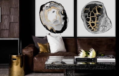
Give your art room to breathe. If you're hanging something above a piece of furniture, make sure the artwork is roughly two thirds the width of the furniture below it. That proportion just WORKS. Don't ask me why. It's one of those design rules that feels right even if you can't explain it.
And please, for the love of all things aesthetic, don't hang tiny frames on massive walls. It looks sad. Like a postage stamp on a billboard. If you've got a big wall, go big. Or create a grouping that fills the space properly.
Secure Mounting is Not Something to Skimp On
Right, so you've figured out where everything goes. Now you've got to actually mount the thing without it crashing down at 3am and giving you a heart attack.
Different walls need different hardware. Plasterboard needs wall plugs or anchors. Brick or concrete needs masonry screws. Old lath and plaster? Good luck, and maybe call a professional because that stuff is temperamental.
Lightweight frames (under 2 kg or so) can usually get away with a simple picture hook. Anything heavier needs proper support. We're talking wall anchors, multiple hooks, maybe even a French cleat for really heavy pieces. Don't trust those sticky strips for anything you actually care about. They might hold for a while, but eventually gravity wins.
Professional installers bring the right hardware for your specific walls. They've got spirit levels, stud finders, the whole toolkit. And more importantly, they've got the experience to know what'll hold and what won't. If you've invested serious money in a piece of art, spending a bit more to have it mounted properly isn't extravagance. It's common sense.
Consider the Room's Purpose and Mood
Not all art belongs in all rooms. Sounds obvious, but you'd be surprised how often people get this wrong.
Your bedroom should feel restful. Maybe that means serene landscapes or soft abstracts. Probably not a chaotic collage or something overly stimulating. The kitchen can handle something playful or food related (though watch out for steam and grease). The living room is your showcase space. Go bold there.
Think about colour too. Does the artwork complement or clash with your existing palette? Sometimes a bit of contrast is GOOD. It creates visual interest. But if your art is fighting with your wallpaper, curtains and furniture all at once, something's got to give.
Bathrooms get forgotten a lot. But they're actually great spaces for smaller prints or watercolours. Just make sure they're properly sealed or framed behind glass because humidity is real.
When to Call in the Professionals
Look, I'm all for DIY. There's satisfaction in doing things yourself. But there are times when hiring a professional installer just makes sense.
If you're dealing with particularly heavy or valuable pieces, don't risk it. If your walls are tricky (old plaster, textured surfaces, brick), don't guess. If you're creating an elaborate gallery wall and you want it done RIGHT the first time, save yourself the headache.
Professional art installers aren't just people with hammers. They understand weight distribution, wall composition, aesthetic balance. They bring proper equipment. They know how to work around things like electrical outlets and light switches without making the whole arrangement look awkward.
And honestly? The peace of mind is worth it. You're not left wondering if that £500 print is going to come crashing down next Tuesday.
Final Thoughts
Displaying art with impact isn't about following rigid rules. It's about understanding a few guiding principles and then adapting them to your space, your art & your personal taste.
Get the lighting right. Hang things at eye level. Think carefully about grouping and spacing. Use proper mounting hardware. Consider the mood of each room. And don't be too proud to call in help when you need it.
Your art deserves to be seen properly. Not as an afterthought tacked onto a wall, but as something that genuinely enhances your space. Take the time to do it well. Future you will thank present you for not taking the lazy route.
(0) comments
We welcome your comments
Log In
Post a comment as Guest
Keep it Clean. Please avoid obscene, vulgar, lewd, racist or sexually-oriented language.
PLEASE TURN OFF YOUR CAPS LOCK.
Don't Threaten. Threats of harming another person will not be tolerated.
Be Truthful. Don't knowingly lie about anyone or anything.
Be Nice. No racism, sexism or any sort of -ism that is degrading to another person.
Be Proactive. Use the 'Report' link on each comment to let us know of abusive posts.
Share with Us. We'd love to hear eyewitness accounts, the history behind an article.