
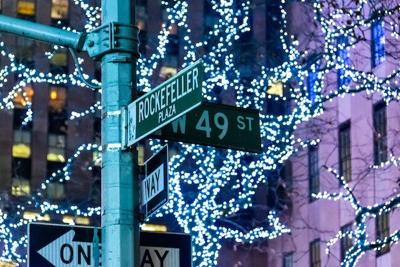

Signs are all around us and we are so used to seeing them that we do not even notice the intricacies and intentionality with which they are created. Street signs are often not different enough to catch our attention, but when they do, they are memorable.
If you are looking to create a memorable street sign or just a customized approach in general then here are a few design tips that will guarantee a great sign.
Moreover, these tips will help you create an accurate vision of what you are looking for so you can easily work with the designer you hire.
1. Fonts And Feelings
Every designer out there will tell you that fonts matter more than you think they do. Brands around the world spend millions of dollars to complete branding exercises, logo revamps, and surveys of psychological effects that a font causes.
So when you are choosing the font for your customized street sign, figure out what kind of feelings the sign evokes in you.
Do you feel at peace when looking at the sign or does it not affect you?
Does it make you feel unsettled?
Can you tell what the text says or do you have to take a minute to decipher the text?
These are all important questions to ask as these are all effects of an unsuitable font for your sign.
Try out different combinations before you settle on a specific one. You can also get inspiration from what other people do or from the fonts the government uses for road signs to take the guesswork out of the process.
If you are in doubt or do not want to spend too much time on the font selection process, your best bet is to stick to a sans-serif font.
2. Color And Readability
Readability can be a major issue when it comes to custom street signs. Graphic designers spend hours trying to create posters and signs that can be read by anyone regardless of common vision impairments such as color blindness.
You also need to keep these impairments in mind when designing your street sign. Even though you may only be adding a street sign to increase the curb appeal of your street, it needs to be readable.
However, this does not mean that your street sign cannot be fun.
As long as you use two high-contrast colors that make your sign easy to read by anyone regardless of weather conditions or vision impairments, you have all the freedom in the world to decide.
Some common combinations for custom street signs are a blue background with white text, brown background with white text, or black background with white text.
Some people even take it one step further by customizing the signs based on their branding or personal aesthetic. For instance, someone who loves pink and has a pink house can go for a pink background with white or black text.
You can even add a bit of gold to add some flair to your street sign and make it look more regal.
3. Decorative Elements
When making decisions about your street sign, you will get the chance to add some decorative elements to your sign too which can make it more eye-catchy.
There are many options and elements in the decorative realm that you can customize for a street sign. For example, you can choose to add a logo to your sign which can be great for brand awareness while helping visitors navigate the area.
You can even choose decorative frames to add to your sign to make it stand out from other boring signs that people have gotten used to. Adding a decorative frame in your brand colors can also make your street sign look cohesive with other branding elements on the sign such as your logo.
Another popular choice for many is to add a creative or decorative scroll to the design to make it look more ornate.
If the buildings around the location of the sign are older or more classical in their architectural style, adding a scroll along with an arm can be the perfect way to fit in.
4. Adding Text
Some obvious consideration needs to be given to the text that you are planning on putting on the sign. The size of the sign that you choose will more likely result in a character limit for the text you want to put on the sign.
If you are creating a custom street sign that only mentions the street then this should not be too much of a problem.
However, if you are planning on adding elements such as a logo or creating signs that require other details such as entry/exit information, you might have to go back and forth to make the text fit.
Try your best to keep an open mind and abbreviate wherever you can. For instance, if you put your company name on the sign then you can use the more simplified logo instead of your main logo.
Moreover, you should think about the effective use of white space in your design as it can have a huge impact on a reader. Just because you can fit more on the sign, you do not have to as it can make your sign harder to read and process.
Conclusion
Next time you see a sign that catches your eye, try to think about what made you take a second look.
Was it the color, the font, the decorative elements, the text, or simply the size?
All in all, creating a custom street sign can be a great way to add value to your commercial or residential property as well as bring a sense of credibility to your business brand and operations.
Keep an open mind when you jump into the designing process and be intentional about every decision you choose to make. You would be surprised to see how the smallest of details can change the look of a sign.

(0) comments
We welcome your comments
Log In
Post a comment as Guest
Keep it Clean. Please avoid obscene, vulgar, lewd, racist or sexually-oriented language.
PLEASE TURN OFF YOUR CAPS LOCK.
Don't Threaten. Threats of harming another person will not be tolerated.
Be Truthful. Don't knowingly lie about anyone or anything.
Be Nice. No racism, sexism or any sort of -ism that is degrading to another person.
Be Proactive. Use the 'Report' link on each comment to let us know of abusive posts.
Share with Us. We'd love to hear eyewitness accounts, the history behind an article.