

Colors are not just a personal preference – they are an actual reflection of your mood and personality. Color psychology is the study of all effects a single color could have on your mood so take good note of all the implications of your favorite color on your surroundings before you apply it.
Picking the perfect color palate for your home is extremely important. It will define the ambiance of your home and showcase your taste too. According to professionals, a color makes for about more than half of our response to any space or product.
So the question now is; how to pick the best color scheme for your homes?
It’s a hard question, even for professionals who have years of experience. You cannot just pick a random color and call it ‘The One.’ So today we will be sharing tips on how to pick the best color palate for your home.
Mood Making – Monochrome or Colorful?
While selecting the color palate for your home, try to explore what effect your general selection of colors has on your mood. For example; if a specific shade of blue makes you feel relaxed then go for it. Similarly, if a monochrome combination has a serene impact on your mood then you could choose that too. Many colors have dissonant effect on a person’s psyche. Violet, for example, could be soothing at a certain angle, but irritating at another. Always try to double check the impact of each color before making any final decisions.

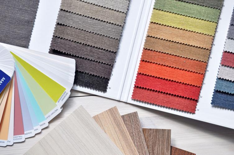
Home Color Palettes
Bottom’s Up – From Floor to Ceiling
When you have selected a color that appeals to you, you can design your home with different shades of it. The most impactful way to make your color palate pop is by designing your room with darker hues at the bottom and lighter hues on top. This way, the floor would have a darker selection of the color and the walls and ceilings would be alternating in lighter shades.
This technique works best with monochrome color palates. The darker floor space would ground your interior while the lighter walls and ceiling would make it seem spacious without seeming too stark.
Referring The Color Wheel
Constantly referring to the Color Wheel is important while selecting the ideal color palate for your home. However, many people do not understand how it works. Let us give you a small crash course.
The color wheel is divided into primary, secondary and tertiary colors with all their respective hues. While one half of it is dedicated to bright colors – red, yellow, orange – the other half has more subdued colors – blue, green, purple. Both parts of the color wheel are made to contrast each other. So if you choose a color from one half – red, for example – you will have to complement it with a color from the other half – for example, blue.
This allows you to select a complementary color scheme without much hassle and too much headaches.

Home Color Palettes
Appraise Your Personal Taste
Many people find it difficult to settle on a specific color combination while selecting a color palate for their homes. In such cases, it would be best to appraise your personal taste. You should look for inspiration in your everyday purchases; e.g. clothes are a definite showcase of personal taste. If you feel like you prefer specific colors in clothing, try to draw inspiration from that while selecting your color palate.
When in Doubt; Go Neutral
If you feel like your preferred color scheme is either too vivid or too gloomy, it is time to go for the timeless and classic neutral color palate. Consisting of grays and beige colors – lovingly dubbed ‘Greige’ by professionals – this color scheme is bound to be an instant hit if done right.
Gray tones have a classy appeal while beige ramps up the sophistication of any interior. So whenever in doubt; go neutral.
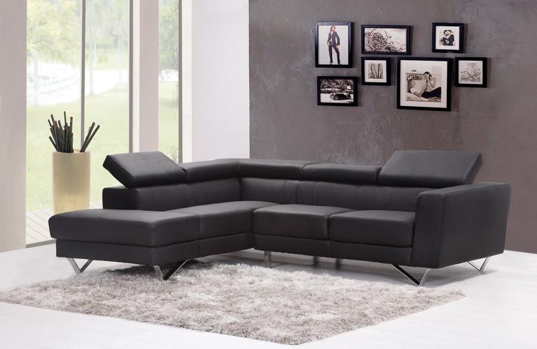
Understanding Visual Weight
An important part of selecting your color palate is understanding the visual weight. Darker colors like red, green, navy blue and black have more visual weight when compared to yellow, lavender, orange and white. So when you choose a color with more visual weight, make sure to pair it up with lighter one. This is why black and white is such a classically hit color scheme – they are the perfect visual counterparts to each other.
Conclusion
As you can see, there are some hard and fast rules when it comes to selecting your color palate. We hope this article helps you get the best color combination for your dream home.
Melina Brown works as a writer for Vertigo Interiors. Her love towards fashion and design is only exceeded by her passion for writing. She is lucky enough to be able to combine and use those interests at work on a daily basis.
For Related Articles Try:
Top-Rated Miramara Kitchen and Bath
Best Bath and Kitchen Designers
(0) comments
We welcome your comments
Log In
Post a comment as Guest
Keep it Clean. Please avoid obscene, vulgar, lewd, racist or sexually-oriented language.
PLEASE TURN OFF YOUR CAPS LOCK.
Don't Threaten. Threats of harming another person will not be tolerated.
Be Truthful. Don't knowingly lie about anyone or anything.
Be Nice. No racism, sexism or any sort of -ism that is degrading to another person.
Be Proactive. Use the 'Report' link on each comment to let us know of abusive posts.
Share with Us. We'd love to hear eyewitness accounts, the history behind an article.