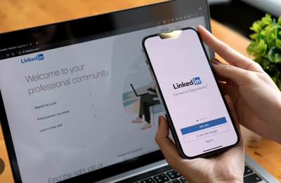
In the world of fine architecture, the most breathtaking designs are often born from the tightest constraints; a challenging landscape inspires a cantilevered room, a narrow lot demands a creative use of vertical space. The Linkedin weekly invitation limit, a dynamic, trust-based cap on your outreach, is the new design constraint for the modern tech marketer. Knowing this limit is the foundational measurement upon which your entire digital brand must be built. The most successful marketers in 2025 are those who are using it as a catalyst for a more elegant, data-driven, and ultimately more human approach to building their professional presence.
The old way of networking was a clumsy, brute-force affair which is the digital equivalent of a poorly planned subdivision, with thousands of identical, low-quality structures thrown up in the hope that a few might attract interest. The new limit is LinkedIn’s response, a new zoning code designed to outlaw this "spray and pray" practice and reward thoughtful, high-quality "construction." It forces us to stop being mass producers and start being master architects of our professional networks. But you cannot architect what you cannot see. Flying blind and simply waiting to hit the invisible fence of the limit is a recipe for frustration, killing campaign momentum, and making any strategic planning impossible.
Architecting Your Dashboard: The Blueprint for Your Brand
The first step in any architectural endeavor is to survey the land and understand your materials. For a tech marketer, this means creating a personal KPI dashboard to track your outreach efforts with the same rigor you'd apply to a multi-million dollar ad campaign. Forget clunky spreadsheets; the modern professional uses an elegant, minimalist tool like Notion or Coda to build a living dashboard. This isn't just for tracking; it's for visualizing the health of your professional brand in real-time, your single source of truth.
This dashboard, your professional blueprint, should focus on a few key metrics that tell a powerful, interconnected story. The first and most critical is your Connection Acceptance Rate. This percentage is the bedrock of your foundation. A high acceptance rate, ideally above 60-70%, is a direct signal to LinkedIn that you are a trusted, valuable member of the community, which in turn keeps your weekly invitation limit healthy and expansive. The second metric is Weekly Invitations Sent. Think of this as the "materials budget" for the week. Are you thoughtfully using your full allocation? The third, and perhaps most important, is your Positive Reply Rate. This measures the structural integrity of your outreach. Are your new connections actually leading to meaningful conversations? Finally, you must track Inbound vs. Outbound Requests. This is your "curb appeal." A steady flow of inbound requests means your content and reputation—your design—are doing the heavy lifting for you.
The Visual Feedback Loop: From Data to Diagnosis
Once these KPIs are in your dashboard, you can begin to visualize them, transforming raw numbers into an intuitive, actionable feedback loop. Imagine a simple line graph tracking your Connection Acceptance Rate over time. For two weeks, it's a beautiful, stable line at 72%. Then, in week three, it dips to 58%. Without a visual dashboard, this change might go unnoticed for weeks, by which time your weekly limit could already be shrinking. But with the chart, the dip is an immediate, unmissable signal. It’s a prompt for a calm diagnosis. You can now ask strategic questions: "Was it the new messaging script we tested for Campaign B?" or "Did we target a new, less receptive audience segment this week?" This visual cue allows you to make small, intelligent adjustments in real-time, preserving the health of your account and the effectiveness of your campaigns.
This data-driven approach also transforms how you plan your outreach. You can now think of your weekly invitation limit as a finite, strategic budget that must be allocated with intention. A simple pie chart in your dashboard can visualize how you've allocated this budget across different marketing initiatives. Perhaps 40% of your invitations are allocated to your primary "Top of Funnel ICP" campaign, 30% are for building relationships with "Strategic Ecosystem Partners," 20% are for connecting with "Industry Influencers and Media," and a final 10% are reserved for "Experimental Audiences." This visual allocation enforces discipline and strategic focus. It ensures your ability to reach out is being invested where it will generate the highest return, and it provides a clear, visual report to stakeholders on where the team's efforts are being directed.
Executing the Blueprint with a Master Craftsman's Tool
A beautiful blueprint is useless without a master craftsman to execute it. Executing these patient, multi-step, data-informed campaigns manually is impractical and prone to human error. This is where smart automation becomes the "smart home system" that runs the mechanics behind the scenes, allowing the architect to focus on the overall design.
The weekly invitation limit is a design constraint that inspires a higher level of craftsmanship. It forces a move away from the chaotic, transactional nature of old-school networking and toward a more thoughtful, architectural approach. By visualizing your data, you are creating a living blueprint for your professional brand. Like a beautifully designed home, a well-architected network is the product of a clear vision, quality materials, and a deep understanding of the underlying structure, which is a valuable asset that will stand the test of time.


(0) comments
We welcome your comments
Log In
Post a comment as Guest
Keep it Clean. Please avoid obscene, vulgar, lewd, racist or sexually-oriented language.
PLEASE TURN OFF YOUR CAPS LOCK.
Don't Threaten. Threats of harming another person will not be tolerated.
Be Truthful. Don't knowingly lie about anyone or anything.
Be Nice. No racism, sexism or any sort of -ism that is degrading to another person.
Be Proactive. Use the 'Report' link on each comment to let us know of abusive posts.
Share with Us. We'd love to hear eyewitness accounts, the history behind an article.