
Many people have experienced a brand that looks polished online but feels completely different in person. A business might look calm and refined online, yet feel completely different when you visit in person. That kind of disconnect makes it difficult to trust what the brand is trying to represent.
Your logo plays a key role in preventing that gap. It doesn’t just appear on your website; it helps guide the overall style of your colors, fonts, and imagery so everything feels like it belongs to the same identity. An AI logo maker can be helpful, but it often creates designs without a clear brand direction behind them.

Digital creators face the same trap. You might grab a design from an Instagram logo creator, but does it match your other channels? Mixing unrelated styles across your channels creates confusion and makes your brand harder to recognize.
How Does Your Logo Set the Rest of Your Design Choices?
Your logo works as the base guideline for everything you design. Everything else—your website, your business cards, your emails—is just a local law. The logo establishes the hard constraints. If you have a sharp, geometric logo, you can't suddenly pivot to a flowery pink website. It ends up feeling like two unrelated brands placed side by side. Shapes dictate personality—respect that.
Round shapes feel safe and friendly. Sharp angles feel aggressive and precise. If you run a security firm, you want those sharp angles. If you then use a bubbly, rounded font on your landing page, you undermine your own authority. You look soft. The logo communicates one tone, while the rest of your branding sends a completely different message.
Why Color Consistency Matters for Your Brand?
Color is the easiest way to break a brand. Most founders pick a color they like for the logo. Let’s say it’s a deep forest green. That works. But then they need a Facebook header. They open a design tool and pick a green that looks "close enough." Then they order t-shirts, and the printer uses a standard bright green ink. Then they build a website and use lime green buttons because they want clicks.
Six months later, the brand has five different greens. It looks messy and very accidental. This is why established brands stay strict about their color choices. Coca-Cola doesn't use "red-ish." They use a specific hex code. They never allow inconsistent colors to appear in their materials.

Your logo sets the master palette. It dictates the primary color and the supporting cast. If your logo is neon orange, your secondary colors need to back that up. Maybe deep charcoal or stark white. You can't throw in a pastel purple just because you feel like it that day. Adding unrelated colors without intention weakens the identity your logo established. The logo already decided the vibe. You have to listen to it.
How Typography Supports Your Logo’s Style
Typography supports the personality your logo introduces. This is where most DIY branding falls apart. You have a sleek, modern logo, but you write your emails in a dusty serif font because it was the default setting.
The font in your logo falls into a category. It is either serious, modern, or creative. Your supporting fonts need to play nice. If your logo is a heavy, bold block text, using a thin, fragile script for your headlines looks weak. It creates a mismatch.
Consistency here means discipline. Your brand’s typography should stay consistent so it becomes easy for people to recognize. It needs to be recognizable before the user even reads the words.
Your Photos Should Match Your Brand Style
Your logo sets the rules for your photography. If your logo communicates craftsmanship, your photos should reflect the same tone.
The imagery needs to live in the same world as the logo. A vintage logo needs warm, grainy photos. A tech logo needs sharp, cool-toned photos. When these elements align, the brand feels more intentional and cohesive. It feels intentional. When they clash, it feels like a template that wasn't finished.
Keeping Your Brand Consistent Across Different Platforms
The modern brand lives in a dozen places. The problem is that platforms have different vibes. Avoid changing your core identity just to match a platform’s trend. You might think making your logo "wacky" helps on TikTok, but it's a trap. Flex your content all you want, but keep the identity rigid.
Your logo should be the same file on LinkedIn as it is on TikTok. Your brand colors should be identical. The moment you start fracturing your identity to "fit in," you dilute your recognition. The goal is instant recognition. Your goal is for people to recognize your brand instantly, no matter where they see it. That kind of stickiness only comes from relentless consistency.
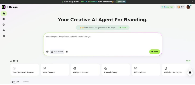
How X-Design AI Agent Helps Maintain Brand Consistency?
This is where the tools matter. Most tools give you a zip file and wish you good luck. X-Design works differently. It functions as a Creative AI Agent. You're not just designing a picture. You're building a system.
Keep Your Brand Elements Aligned With X-Design
This is the fix for color drift. Once you finalize your logo, X-Design's "Brand Memory" locks in your choices. It remembers that specific hex code. It remembers the font family.
So, when you decide you need an "Open for Business" poster or a menu, you don't start from a blank slate. You don't hunt for codes. The system applies your brand DNA to the new design automatically. It forces consistency. It won't let you accidentally use the wrong green. It helps you stay consistent by applying the same choices across every design.

Previewing Your Logo on Real Products and Materials
Another way it sets the tone is through mockups. Digital previews often look different from how designs appear on real objects. That dragon illustration might look epic online, but on a uniform, it’s just a mess.
X-Design lets you project your identity onto real objects—packaging, signage, apparel. This is a sanity check. It allows you to see if your tone translates to reality. Does that sleek tech logo look good on a coffee mug? Or does it look cold? Seeing your logo in real-world settings helps you adjust it before finalizing.
Why X-Design Works Well for Busy Business Owners?
This is for restaurant owners and real estate agents—people who don't have time for a crash course in color theory. They simply need every part of their branding to look consistent. X-Design automates that alignment. It ensures that the digital flyer you post on Facebook looks like it came from the same company that printed the physical loyalty cards.
Consistency is what makes a brand feel familiar and trustworthy. You want the design to fade so the message lands. Constant changes just force customers to re-learn who you are. That creates friction.
Your logo dictates the rules—whether you’re premium or playful. Don't fight it. Use X-Design to lock down your assets and avoid switching fonts in different materials.


(0) comments
We welcome your comments
Log In
Post a comment as Guest
Keep it Clean. Please avoid obscene, vulgar, lewd, racist or sexually-oriented language.
PLEASE TURN OFF YOUR CAPS LOCK.
Don't Threaten. Threats of harming another person will not be tolerated.
Be Truthful. Don't knowingly lie about anyone or anything.
Be Nice. No racism, sexism or any sort of -ism that is degrading to another person.
Be Proactive. Use the 'Report' link on each comment to let us know of abusive posts.
Share with Us. We'd love to hear eyewitness accounts, the history behind an article.