
Most jewelry boxes are fine. They protect the product, look decent on a shelf, and get the job done.
But the boxes people remember are different. They make someone pause for half a second, run their finger over the texture, and think, "This feels expensive." That reaction is not luck. It is design decisions stacked in the right order.
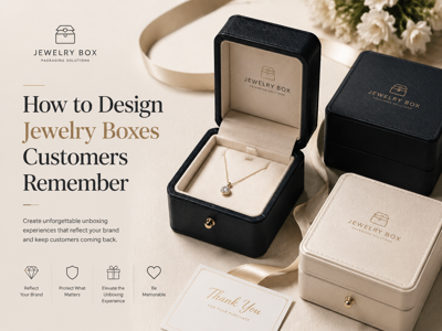
If your goal is packaging that drives repeat purchases, referrals, and better brand recall, focus on four levers that actually move memory color, structure, material, and the unboxing flow.
If you are researching premium packaging benchmarks before committing to production, this is a useful starting point Richpack.
Start With The Feeling You Want To Be Remembered For
Before you pick a color or box style, answer one question first what should the customer feel the moment they touch the box?
Elegant and minimal. Romantic and gift-ready. Bold and fashion-forward. There is no universal right answer, but there is a wrong one, and it is trying to be all of them at once.
The brands that win this game choose a lane and design everything around it. Their typography, opening style, insert design, and finish all point in the same emotional direction. That consistency is what memory is made of.
Also, design for the real buying context, not your mood board. A bridal jewelry unboxing moment is different from a fast-moving ecommerce order. A boutique display box behaves differently from a shipping-first mailer. Same product category, different memory mechanics.
Color Is Recognition At First Glance
People often remember color before they remember logo details. That is why color decisions deserve more rigor than “this looks pretty.”
A practical approach is simple one dominant brand color, one supporting tone, one accent finish. That gives you enough flexibility to create variation without losing identity.
Deep emerald, midnight blue, or burgundy can signal richness. Soft neutrals can communicate modern luxury. Metallic accents can elevate, but only when used with restraint. Too much foil and everything starts to look noisy.
One more thing people forget test in real light. Packaging that looks perfect in digital mockups can print warmer, duller, or harsher than expected. Check samples in daylight and indoor retail lighting before final approval.
Structure Shapes The Emotional Pace
A jewelry box is a tiny stage. The way it opens controls the timing of the reveal, and timing changes perception.
A rigid lift-off box feels ceremonial. A magnetic closure can feel clean and contemporary. A drawer box creates a slower, more deliberate reveal. None is automatically best. The right one depends on product positioning and customer expectations.
Where many brands slip is the mismatch. Delicate jewelry in a clunky box feels off. Premium pricing with flimsy opening mechanics feels worse. Even small friction, like a hard-to-remove insert, can quietly kill the experience.
Map the opening sequence like a short script. What do they see first? What do they touch next? Is there a secondary brand cue inside? Good structure makes these moments feel inevitable, not accidental.
Materials: Decide Whether The Box Gets Kept Or Tossed
Memorable packaging usually stays on the dresser. Forgettable packaging goes in the bin.
Material is the difference.
A rigid board gives weight and durability. Specialty paper adds visual depth. Velvet, suede, or microfiber inserts change the tactile story completely. Recycled materials can support a sustainability narrative, but only if execution still feels premium.
Texture contrast is especially powerful. Matte outside, soft inside. Clean exterior, warm interior touchpoint. These subtle shifts make the box feel considered, and “considered” is what customers describe as premium.
Do not ignore practical testing. If a beautiful surface scuffs in transit, the memory you create is disappointment, not delight.
Unboxing Is Where Memory Becomes Word Of Mouth
People do not share packaging because it exists. They share it because it made them feel something.
That usually comes from sequence and detail. A clean first reveal. A well-framed product position. A short card that sounds human, not corporate. Maybe a care note that feels useful instead of promotional fluff.
Microcopy matters more than most teams expect. “Made to be worn daily” lands better than generic luxury slogans. The goal is not to sound poetic. The goal is to sound real.
And yes, design for cameras too. Most unboxing photos are taken quickly on phones in imperfect lighting. If your interior causes glare or visual clutter, the product loses impact in the very moment that could have generated social proof.
Branding Finishes Work Best When They Are Restrained
It is tempting to use every premium finish available. Foil, emboss, deboss, UV, and texture overlays, all in one box.
Usually, that is a mistake.
Strong branding feels intentional, not overloaded. One or two finishing techniques, executed cleanly, often look more expensive than five-layered effects competing for attention.
Placement matters too. Exterior branding builds recognition before opening. Interior branding can create a second, quieter brand moment. Both are useful when spacing is generous and hierarchy is clear.
If you are planning custom runs and balancing design ambition with cost control, this page is useful for evaluating options custom jewelry boxes with logo wholesale.
Why Some Jewelry Packaging Gets Forgotten Fast
Forgettable packaging rarely fails in one dramatic way. It fails due to small inconsistencies.
The palette does not align with brand identity. The opening action feels awkward. The insert quality does not match the product pricing. The message card reads like generic ad copy. Shipping wear appears too quickly.
Individually, each issue seems minor. Together, they flatten the experience.
Customers may still like the jewelry, but they will not remember the box. And if they do not remember the box, they are less likely to remember the brand behind it.
A Better Pre-Production Check
Before signing off, run a practical memory check with your team.
Can someone identify your brand from silhouette and color alone? Does the opening flow feel smooth without explanation? Does the texture match your price point? Does it photograph well in normal room light? Is the logo present without overpowering the product?
Then stress-test execution. Batch consistency. Transit durability. Edge wear. Print accuracy. Great packaging concepts are common. Great packaging execution is where brand advantage actually shows up.
Designing jewelry boxes that customers remember is not about adding more features. It is about aligning the right ones.
When color, structure, material, and unboxing all tell the same story, the packaging stops being a container. It becomes part of the product experience and part of the reason customers come back.
(0) comments
We welcome your comments
Log In
Post a comment as Guest
Keep it Clean. Please avoid obscene, vulgar, lewd, racist or sexually-oriented language.
PLEASE TURN OFF YOUR CAPS LOCK.
Don't Threaten. Threats of harming another person will not be tolerated.
Be Truthful. Don't knowingly lie about anyone or anything.
Be Nice. No racism, sexism or any sort of -ism that is degrading to another person.
Be Proactive. Use the 'Report' link on each comment to let us know of abusive posts.
Share with Us. We'd love to hear eyewitness accounts, the history behind an article.