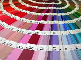
Pantone Color Institute (PCI) helps companies make the best decisions about colors, whether it be for their products or for their brands. The Pantone Color Institute offers a variety of services to companies, including custom color solutions, color trend forecasting, and brand color development. The color experts in the Institute serve companies, brands, and individuals all across the world, working to find a customized solution for their specific needs.
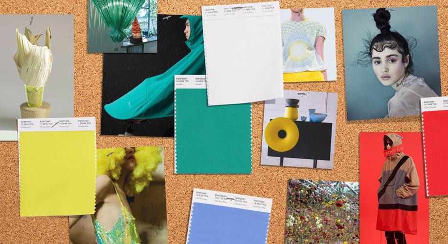
This past September, Pantone released their Fashion Color Trend Report— an overview of colors that correspond to top colors in fashion from all kinds of designers and showing at New York Fashion Week— for the season of Spring 2018. The report is a key signifier of color collections we can anticipate seeing in fashion shows and designs all around and serves as an easy guide to this Spring’s most important trends in color. The Spring 2018 Report consists of a total of 16 new colors: 12 "call-out" shades and 4 "seasonal classics" which combine to make a diverse palette that speaks to self-expression. The color collection is described by the Institute as "wildly divergent" and "a kaleidoscopic bounty of uplifting shades and feel-good tones." These selected swatches of color encourage experimentation and conversation through fashion and textile. As stated by Laurie Pressman from Pantone Color Institute, "the color story for Spring 2018 is a perfect reflection of this new sentiment" of dressing without restrictions.
Spring 2018 Top 12 Color Palette
This palette stimulates a sense of playfulness, while also containing a distinct complexity that is ideal for unique color combining.
Colors:
Meadowlark: a bold yellow that exudes confidence and illuminates everything around us
Cherry Tomato: a fiery red that demands attention
Little Boy Blue: a color reminiscent of the sky on a typical San Diego day; this blue shade suggests continuity and reassures us with a promise of another clear day
Chili Oil: an earthy color with more brown than red that adds some darkness to the palette
Pink Lavender: a romantic and soothing color that charms
Blooming Dahlia: a peachy color that seems to suggest a floral scent, but still manages to draw the eyes
Arcadia: a retro yet modern color that is a cooler green with noticeable blue undertones
Ultra Violet: a purple that is deep and conveys originality
Emperador: another brown shade, this one being slightly more strong in its base color of brown
Almost Mauve: lighter than baby pink, it evokes the colors of small flower petals, adding a bit of nostalgia to the palette
Spring Crocus: a flamboyant fuchsia
Lime Punch: the name says it all with this one; a bright green, sharp and pungent like the citrus fruit


Spring 2018 Classic Color Palette (4 colors)
The four Classic colors in the Spring Palette are beautiful neutrals that will compliment each of the colors from the Top 12 colors, adding more depth and diversity.
Colors:
Sailor Blue: a classic navy that brings to mind anchors and hats on a ship
Harbor Mist: a mid-tone gray that solidifies the Spring 2018 palette
Warm Sand: a neutral shade that evokes warmth
Coconut Milk: represents the off-white color for the Spring 2018 season


(0) comments
We welcome your comments
Log In
Post a comment as Guest
Keep it Clean. Please avoid obscene, vulgar, lewd, racist or sexually-oriented language.
PLEASE TURN OFF YOUR CAPS LOCK.
Don't Threaten. Threats of harming another person will not be tolerated.
Be Truthful. Don't knowingly lie about anyone or anything.
Be Nice. No racism, sexism or any sort of -ism that is degrading to another person.
Be Proactive. Use the 'Report' link on each comment to let us know of abusive posts.
Share with Us. We'd love to hear eyewitness accounts, the history behind an article.