

For decades, the unwritten rule of traditional interior design was simple: Pick a wood stain and stick to it. If you bought a cherry wood coffee table, you were essentially "married" to cherry wood for your side tables, your TV stand, and your bookshelves. The result? A room that felt safe, uniform, and, quite frankly, a little bit flat.
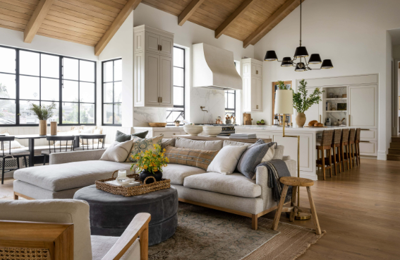
Today, that rule has been officially thrown out the window. Walk into any professionally designed space, and you will see a rich tapestry of materials: a deep walnut sideboard living harmoniously next to white oak floors, accented by a teak lounge chair. Mixing wood tones is the secret ingredient that takes a room from "furniture showroom" to "curated home." It adds depth, history, and an organic warmth that a monochromatic scheme simply cannot achieve.
However, mixing woods can feel intimidating. There is a fine line between an eclectic, layered look and a chaotic mishmash. How do you ensure your living room looks intentional rather than accidental? The secret lies in understanding undertones, contrast, and balance.
The "Matchy-Matchy" Trap vs. The Curated Look
The problem with buying a pre-packaged "living room set" where every piece matches perfectly is that it lacks personality. It tends to make a space feel heavy and one-dimensional. On the other hand, mixing woods mimics the way homes evolve naturally over time—gathering pieces you love, regardless of whether they were bought on the same day.
To achieve this successfully, you need a strategy. You need access to a variety of high-quality finishes that speak to each other. For example, when exploring modern retailers like www.povison.com, you will notice that their collections span a spectrum from deep, rich walnuts to airy, light ashes. This variety is essential. It allows you to select pieces that stand alone as beautiful design objects while still contributing to the overall harmony of the room.
Here is your step-by-step guide to mastering the art of the mix.
1. Identify Your Dominant Wood Tone
Before you start bringing in new pieces, you need to identify the "boss" of the room. In most living rooms, this is usually the flooring. Since you likely cannot change your floors easily, they become your baseline.
If you have wood floors, that is your primary tone. If you have carpet or tile, your largest piece of furniture—such as a large entertainment center or a dining table—becomes the dominant tone.
The Goal: You aren't trying to match this dominant tone perfectly. In fact, trying to match it and missing by a shade (the "near miss") looks worse than choosing a totally different color. Instead, you want to choose secondary tones that complement or contrast with this base.
2. Understand the Undertones (The Secret Sauce)
This is where most people get tripped up. Wood isn't just "brown." All wood finishes have an undertone—a subtle underlying color that dictates what they will pair well with. Generally, woods fall into two camps:
Warm Undertones: These woods look yellow, orange, or red. Think Cherry, Mahogany, Pine, and some Oaks.
Cool/Neutral Undertones: These woods look grey, ashy, or strictly brown without the redness. Think Ash, Maple, Weathered Oak, and distinctively, Walnut.
The Golden Rule: While you can mix light and dark woods, it is generally safer to stick to the same family of undertones. For instance, a warm, honey-colored oak floor looks fantastic with a deep, warm mahogany table. They are different darkness levels, but they share a warm "temperature." However, mixing a very red cherry wood with a grey-washed driftwood can create a visual clash because the warm and cool tones fight for attention.
Exception: Walnut is the "universal donor" of the wood world. Its neutral, purple-brown base allows it to play nicely with almost anything, making it a favorite for modern furniture designers.
3. Embrace High Contrast
If you are going to mix woods, be bold about it. The "near miss" mentioned earlier creates visual tension—it looks like you tried to match and failed. High contrast, on the other hand, looks deliberate.
If you have light, blonde wood floors, don't buy a beige-wood coffee table. Go for a dark Charcoal or rich Walnut piece. The contrast separates the furniture from the floor, allowing the silhouette of the furniture to pop. This is especially important for leggier furniture; you want to see where the floor ends and the table begins.
A Classic Combo: Light Oak Floors + Walnut Furniture + White Accents. This trio is the hallmark of Mid-Century Modern and Scandinavian design. It feels airy yet grounded.
4. The "Bridge" Element
Sometimes, despite your best efforts, two wood tones might feel a bit disjointed. This is where a "bridge" comes in to unite them.
The Rug: A rug is the most effective buffer. If you place a dark wood coffee table directly onto a dark wood floor, it disappears into a "black hole." Placing a light, textured rug between them separates the woods, allowing them to coexist without touching.
Bi-Color Furniture: Look for pieces that naturally incorporate two tones, such as a credenza with a walnut frame and black painted doors. This piece essentially acts as a diplomat, negotiating peace between the dark and light elements in the room.
5. Repetition is Key
If you introduce a new wood tone, do not let it be a lonely island. You must repeat it at least once elsewhere in the room to make it feel integrated.
Let’s say you have oak floors and you buy a stunning dark walnut TV stand. To tie it in, you don’t need another huge piece of walnut furniture. It could be something small:
The legs of your sofa.
A picture frame on the wall.
A wooden bowl on the coffee table.
The legs of a side chair.
By repeating the tone, you create a "rhythm" in the room. Your eye bounces from the TV stand to the picture frame to the chair legs, weaving the room together visually.
6. Don't Forget Non-Wood Textures
If a room has too much wood—wood floors, wood walls, wood tables, wood chairs—it starts to look like a sauna or a lodge. To make the mixed woods sing, you need to break them up with other materials.
Metal: Matte black, brass, or chrome hardware cuts through the visual weight of wood.
Stone: A marble coffee table or a ceramic side table provides a cool, hard surface that contrasts beautifully with the organic grain of wood.
Upholstery: Soft fabrics are the ultimate counterbalance. A plush velvet sofa or a bouclé armchair softens the hard lines of wooden case goods.
Mixing wood tones is a journey away from perfectionism and toward curation. It allows you to buy pieces you truly love, rather than pieces that simply "match." It gives you the freedom to invest in a timeless high-quality dining table today, knowing that it will still look good with the coffee table you buy five years from now.
The next time you are furnishing a room, stop worrying about whether the swatch matches the floor perfectly. Instead, ask yourself: Does this have the right undertone? Is there enough contrast? Do I love the grain? If the answer is yes, you are on your way to building a living room that feels collected, cohesive, and effortlessly stylish.
(0) comments
We welcome your comments
Log In
Post a comment as Guest
Keep it Clean. Please avoid obscene, vulgar, lewd, racist or sexually-oriented language.
PLEASE TURN OFF YOUR CAPS LOCK.
Don't Threaten. Threats of harming another person will not be tolerated.
Be Truthful. Don't knowingly lie about anyone or anything.
Be Nice. No racism, sexism or any sort of -ism that is degrading to another person.
Be Proactive. Use the 'Report' link on each comment to let us know of abusive posts.
Share with Us. We'd love to hear eyewitness accounts, the history behind an article.