

Small living rooms present unique decorating challenges, but strategic color choices can dramatically transform how spacious and inviting these areas feel. Rather than viewing limited square footage as a constraint, savvy homeowners recognise that thoughtful color application creates optical illusions that expand perceived dimensions whilst establishing welcoming atmospheres. Understanding color theory and its psychological effects empowers you to make decisions that maximize your compact space's potential.
The Psychology of Color in Confined Spaces
color profoundly influences our spatial perception and emotional responses to rooms. Light wavelengths interact with our eyes and brains in ways that can make walls appear to advance or recede, ceilings feel higher or lower, and spaces seem larger or more intimate.
Light colors reflect more natural and artificial illumination, bouncing light around rooms and creating airier, more expansive feelings. This reflective quality prevents the visual heaviness that darker shades can introduce, making light palettes particularly valuable in compact living areas with limited windows or natural light.
However, darker colors needn't be entirely avoided. When applied strategically—perhaps on a single feature wall or in rooms with excellent natural light—deeper tones add depth and sophistication without overwhelming. The key lies in understanding balance and proportion rather than adhering to rigid rules.
Light and Airy: The Power of Pale Palettes
Classic Whites and Creams
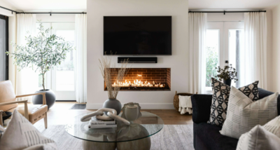
Pure whites create ultimate light reflection, making them perennial favourites for small spaces. However, stark white can feel sterile or clinical. Softer variations—ivory, cream, or whites with subtle undertones—provide warmth whilst maintaining spacious feelings. These nuanced neutrals complement virtually any furniture style and allow decorative accessories to take centre stage.
Warm whites with yellow or pink undertones suit north-facing rooms lacking abundant sunlight, adding cosiness that cool whites cannot achieve. Conversely, cool whites with blue or grey undertones work beautifully in south-facing spaces, tempering intense natural light with refreshing crispness.
Soft Greys and Greiges
Grey's popularity stems from its versatility and contemporary appeal. Light grey tones create sophisticated backdrops that feel more dynamic than pure white whilst maintaining similar space-enhancing properties. Greige—the marriage of grey and beige—offers warmth that pure grey sometimes lacks, creating inviting environments that still feel modern.
These neutral foundations work exceptionally well when layered with textured fabrics and varied tonal accessories. The subtle depth prevents monotony whilst the overall lightness preserves spacious feelings.
Pale Blues and Greens
Receding colors like soft blues and gentle greens create psychological distance, making walls appear farther away than they physically are. These cool tones evoke natural elements—sky and foliage—bringing calming, restorative qualities indoors.
Powder blue, duck egg, and sage green provide character beyond neutrals whilst maintaining space-enhancing properties. These colors suit both traditional and contemporary schemes, adapting beautifully to different furniture styles and decorative approaches.
Strategic Use of Darker Tones
Contrary to conventional wisdom, dark colors can work in small living rooms when applied thoughtfully. Creating a cocoon-like atmosphere through deep charcoals, navy blues, or forest greens establishes drama and intimacy that light colors cannot achieve.
The key lies in ensuring adequate lighting—both natural and artificial—prevents these spaces feeling oppressive. Layered lighting including ambient, task, and accent sources creates depth and prevents flat, cave-like effects. Additionally, limiting dark colors to one or two walls whilst keeping ceilings light maintains vertical spaciousness.
Rich colors provide excellent backdrops for artwork and light-colored furniture, creating striking contrasts that add visual interest. This approach particularly suits rooms used primarily in evenings, where atmospheric, enveloping spaces feel more appropriate than bright, airy ones.
The Feature Wall Approach
Feature walls offer a compromise between light, spacious schemes and the character that bolder colors provide. Painting one wall in a deeper or more saturated tone adds personality whilst keeping remaining walls light preserves openness.
Strategic feature wall placement matters considerably. Walls with architectural interest—those housing fireplaces, alcoves, or built-in shelving—make natural focal points. Alternatively, the wall opposite the entrance draws eyes forward, creating depth perception as viewers enter.
color choice for feature walls depends on desired atmosphere and existing furnishings. When exploring small living room color ideas, consider how feature wall colors complement rather than compete with furniture, flooring, and accessories already in place.
Ceiling and Trim Considerations
Ceilings represent often-overlooked opportunities in small room decorating. Whilst white remains standard, subtle color applications can dramatically alter spatial perception. Painting ceilings slightly darker than walls—perhaps a shade or two deeper from the same color family—creates cosy, intimate feelings.
Conversely, extending wall colors onto ceilings blurs boundaries between surfaces, making rooms feel larger by eliminating visual stops. This technique works particularly well with pale colors, creating seamless, expansive effects.
Skirting boards and architraves traditionally receive white paint, creating crisp definition. However, painting these elements the same color as walls creates continuous surfaces that make rooms appear larger by reducing visual interruption.
Coordinating with Natural and Artificial Light
Light quality profoundly affects color appearance. North-facing rooms receive cooler, indirect light that can make colors appear greyer and less vibrant. These spaces benefit from warm colors—creams, soft yellows, or warm greys—that compensate for cool natural light.
South-facing rooms enjoy abundant warm sunlight that intensifies colors, sometimes making warm tones feel overwhelming. Cool colors—soft blues, greens, or cool greys—balance intense natural light beautifully.
Artificial lighting color temperature matters equally. Warm-toned bulbs (2700K-3000K) enhance warm paint colors whilst potentially muddying cool tones. Cooler bulbs (4000K+) complement cool colors but can make warm palettes feel washed out. Testing paint samples under your actual lighting conditions prevents disappointing surprises.
Creating Flow Between Connected Spaces
Small living rooms often connect directly to kitchens, hallways, or dining areas. color continuity across these spaces creates visual flow that makes entire areas feel more expansive. Using the same color throughout or selecting coordinating shades from the same color family eliminates jarring transitions that fragment space.
Alternatively, subtle color progression—moving from lighter to slightly darker tones as you move through spaces—creates gentle depth whilst maintaining cohesion.
Frequently Asked Questions
Should I avoid dark colors entirely in small living rooms?
Not necessarily. Whilst light colors generally make spaces feel larger, dark colors create intimate, sophisticated atmospheres when applied thoughtfully. Ensure excellent lighting, limit dark colors to one or two walls, and keep ceilings light. Consider room usage—spaces primarily used in evenings suit darker, cosier schemes more than those used throughout the day.
How do I choose between warm and cool colors for a small space?
Consider your room's natural light direction and quality. North-facing rooms benefit from warm colors compensating for cool light, whilst south-facing spaces suit cool colors balancing intense sunshine. Personal preference matters too—warm colors feel cosy and inviting, whilst cool tones create calm, refreshing atmospheres. Test samples in your actual lighting conditions before committing.
Can I use bold accent colors in small living rooms?
Absolutely. Bold accents through accessories, artwork, or single feature walls add personality without overwhelming. The 60-30-10 rule provides useful guidance: 60% dominant color (usually walls), 30% secondary color (larger furniture), and 10% accent color (cushions, artwork, accessories). This creates balance whilst incorporating vibrant touches.
Will painting my ceiling the same color as walls make the room feel bigger?
Yes, extending wall color onto ceilings blurs boundaries between surfaces, creating seamless, expansive effects. This works particularly well with light colors. However, very dark colors extended onto ceilings can feel oppressive unless ceilings are particularly high. Test this approach in well-lit rooms where the technique enhances rather than overwhelms.
How important is paint finish in small living rooms?
Extremely important. Matt finishes absorb light, hiding imperfections but potentially making spaces feel slightly smaller. Eggshell and satin finishes reflect more light, enhancing spaciousness whilst remaining practical for living areas. Gloss finishes maximize light reflection but highlight wall imperfections and can feel too shiny for large wall surfaces, though they work well on trim and doors.
color choices profoundly impact how small living rooms feel and function. Whilst light palettes reliably create spacious, airy atmospheres, darker tones can establish sophisticated intimacy when applied strategically. The most successful schemes balance personal preferences with practical considerations—natural light quality, room usage patterns, and existing furnishings all influence optimal color selection. By understanding color psychology, testing samples thoroughly, and considering how different tones interact with lighting and architectural features, you can transform your compact living room into a space that feels both larger and more inviting than its actual dimensions suggest.


(0) comments
We welcome your comments
Log In
Post a comment as Guest
Keep it Clean. Please avoid obscene, vulgar, lewd, racist or sexually-oriented language.
PLEASE TURN OFF YOUR CAPS LOCK.
Don't Threaten. Threats of harming another person will not be tolerated.
Be Truthful. Don't knowingly lie about anyone or anything.
Be Nice. No racism, sexism or any sort of -ism that is degrading to another person.
Be Proactive. Use the 'Report' link on each comment to let us know of abusive posts.
Share with Us. We'd love to hear eyewitness accounts, the history behind an article.