
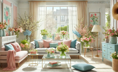
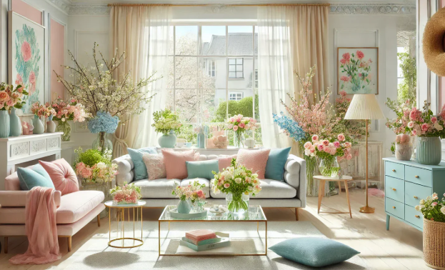
Spring has a way of making a home feel ready for a little lift. The rooms that felt cozy and layered in winter can suddenly seem a bit heavy, the darker accents feel more serious than inviting, and the urge to bring in color becomes hard to ignore.
The trick is knowing when to stop. Elegant spring decorating is not about filling every surface with pastel accessories or making the living room look like it has been attacked by a flower market. The most refined updates are usually small, intentional, and easy to edit.
With the right mix of soft color, lighter texture, fresh greenery, and natural light, a home can feel brighter and more seasonal without losing its polish. These ideas for adding spring colors are designed for interiors that want freshness, not chaos.
Start With One Beautiful Spring Shade
The easiest way to keep spring color elegant is to choose one main accent shade and use it with restraint. A pale blue vase, two linen pillows, and a small piece of artwork with the same tone can make the room feel intentional. Six competing pastels scattered across every surface can make it feel like the house got into the candy drawer.
Soft green, blush, sky blue, butter yellow, lavender, and warm coral can all work beautifully when paired with neutrals. Cream, ivory, warm white, mushroom, taupe, natural wood, woven textures, and stone help ground lighter shades so they feel sophisticated rather than sugary.
If you are already planning a broader seasonal refresh, FINE’s guide to simple home upgrades that add everyday value is a useful companion because small design changes often create the biggest visual lift.
Use Textiles for Low-Commitment Color
Textiles are the safest place to begin because they can be changed without regret, remodeling, or a conversation with a contractor. A linen pillow in sage green, a pale blue throw, or a soft floral cushion can bring spring colors into a room without making a permanent commitment.
As the weather shifts, replace heavy winter layers with lighter fabrics. Linen, cotton, and soft woven textures feel more seasonal than thick velvet or chunky knits. The change does not have to be dramatic. Sometimes one lighter throw over the arm of a sofa does more than a cart full of decorative objects trying very hard to be charming.
Let Rugs Add Soft Pattern and Warmth
A rug can quietly pull a spring palette together, especially in living rooms, bedrooms, and dining spaces. Look for muted patterns, faded florals, soft stripes, pale geometric designs, or natural fiber textures. The rug does not need to shout. It simply needs to connect the colors in the room.
For homeowners thinking about texture as much as color, FINE’s article on what rugs contribute to style and texture in modern interiors offers a helpful look at how flooring layers can change the feel of a room without touching the walls.
Refresh Artwork Before Repainting the Room
Artwork is one of the most graceful ways to introduce spring colors. Botanical prints, soft abstracts, landscape photography, watercolors, or framed textile pieces can add seasonal color without requiring a ladder, a paint tray, or the emotional commitment of repainting a room.
If a space feels flat after winter, art can bring in movement and color while keeping the room polished. A single oversized piece with hints of green, rose, blue, or ochre can make a room feel freshly styled. Smaller pieces can also work when grouped thoughtfully, especially in hallways, breakfast nooks, bedrooms, and reading corners.
Bring in Greenery Without Creating a Jungle
Fresh greenery is one of the simplest spring updates, but restraint still matters. A branch arrangement on a console, herbs in the kitchen, a fern in a ceramic planter, or a small tree near a window can make a room feel alive without turning it into a greenhouse with furniture.
Houseplants also need the right conditions to stay attractive. The University of Minnesota Extension recommends choosing indoor plants with growing requirements that match the home’s humidity, light, and temperature. That practical advice matters because a struggling plant is not a design accent. It is a cry for help in a pretty pot.
Use Flowers as Temporary Color
Fresh flowers are ideal for anyone who wants spring color without long-term design consequences. Tulips, ranunculus, daffodils, hyacinths, peonies, sweet peas, and flowering branches bring color, fragrance, and movement into a room for a short period of time.
The key is to keep arrangements relaxed. A low bowl of blooms on a coffee table, a single-color bouquet on a dining table, or a few stems in a bedside vase can feel more elegant than an oversized arrangement blocking everyone’s view and quietly demanding applause.
Lighten the Window Treatments
Spring is a good time to reconsider how natural light moves through the home. Heavy drapes can be beautiful, but rooms often benefit from lighter window layers as the season changes. Sheer panels, linen curtains, woven shades, or simple Roman shades can soften sunlight while keeping the space airy.
The U.S. Department of Energy explains that window coverings can support comfort and help manage heat gain or heat loss depending on the type of covering, climate, season, and how they are used. In design terms, that means window treatments can be both beautiful and useful, which is always the best kind of decorating.
Add Color Through Small Decorative Layers
Spring colors do not need to come from large furniture pieces. In fact, smaller layers are often more elegant. Ceramic bowls, glass vases, lampshades, trays, table linens, books, candles, and decorative boxes can all add color in a controlled way.
A blush vase on a mantel, a butter-yellow bowl in the kitchen, a soft green lamp on a nightstand, or pale blue napkins on a dining table can shift the mood without overwhelming the room. These details are easy to move, edit, and replace as the season changes.
Try a Soft Paint Accent
Paint is powerful, but it does not have to cover every wall. A powder room, built-in niche, bookcase back, pantry door, mudroom bench, or small entry area can handle a spring-inspired shade beautifully. This approach adds freshness without turning the whole house into a color experiment.
If painting indoors, product choice and ventilation matter. The U.S. Environmental Protection Agency explains that volatile organic compounds can be emitted by many household products, including paints and finishes, and that concentrations of many VOCs are often higher indoors than outdoors. Low-VOC options and good ventilation are worth considering when refreshing interior surfaces.
Balance Pastels With Natural Materials
Natural materials help spring colors feel sophisticated. Wood, rattan, cane, linen, stone, marble, ceramic, wool, jute, and aged brass all give pastel or nature-inspired shades a more grounded look. Without texture, spring color can become flat or overly sweet.
For example, sage green feels more refined next to oak or walnut. Blush looks calmer with stone and cream. Pale blue feels fresher with white linen and woven accents. Yellow becomes more elegant when used sparingly with warm wood and natural fibers. The supporting materials do much of the work.
Edit Before You Add More
The secret to elegant spring decorating is editing. Before buying anything new, remove what feels heavy, dark, tired, or overly wintery. Put away chunky throws, dark pillows, heavy tabletop pieces, and anything that makes the room feel visually crowded.
Once the space has room to breathe, the spring updates will matter more. A vase of flowers, a lighter throw, or a softer rug has more impact when it is not competing with every object the room has collected since Thanksgiving.
Use Spring Color to Make Small Rooms Feel Lighter
Small rooms can benefit from spring colors when they are used carefully. Pale shades, light-reflecting materials, and natural textures can make compact spaces feel more open. Soft blue, warm white, pale green, and gentle blush can all help create a lighter mood when paired with good lighting and uncluttered surfaces.
FINE’s article on maximizing space through color in a compact living room explores this idea further, especially for homeowners trying to make smaller rooms feel brighter and more intentional.
Keep the Whole Home Cohesive
Seasonal decorating should not make each room feel like it belongs to a different personality. Repeat one or two colors throughout the home in subtle ways. A soft green pillow in the living room, a small green vase in the entry, and herbs in the kitchen can create a quiet thread without making the theme obvious.
This is especially important in open-concept homes, where rooms visually connect. The colors do not need to match exactly, but they should speak the same language. Think fresh, calm, and layered rather than “spring aisle at the craft store.”
The Bottom Line on Spring Color
Elegant spring decorating is about lightness, not excess. A few thoughtful color updates can make a home feel fresher, brighter, and more welcoming without overwhelming the interior. The best changes are small, intentional, and easy to edit as the season shifts.
Start with one or two soft colors, add natural texture, bring in flowers or greenery, and let more light into the room. When spring color is handled with restraint, it does not compete with the home’s design. It enhances it, which is exactly the point.


(0) comments
We welcome your comments
Log In
Post a comment as Guest
Keep it Clean. Please avoid obscene, vulgar, lewd, racist or sexually-oriented language.
PLEASE TURN OFF YOUR CAPS LOCK.
Don't Threaten. Threats of harming another person will not be tolerated.
Be Truthful. Don't knowingly lie about anyone or anything.
Be Nice. No racism, sexism or any sort of -ism that is degrading to another person.
Be Proactive. Use the 'Report' link on each comment to let us know of abusive posts.
Share with Us. We'd love to hear eyewitness accounts, the history behind an article.