
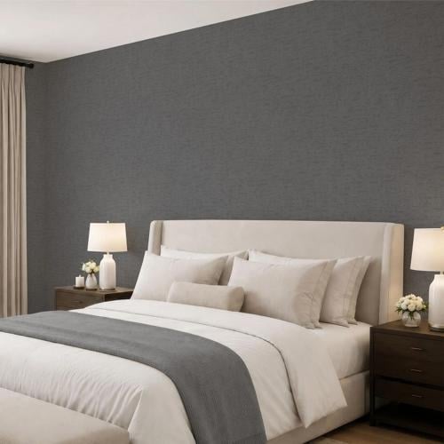

Gray has been a staple of modern interior design for years, but today's approach is moving beyond flat, uniform gray walls. The focus is increasingly on nuanced shades, subtle textures, and tonal combinations that give neutral interiors greater depth. From soft silver and misty gray to graphite and charcoal, the right shade can provide a sophisticated foundation while allowing furniture, materials, and architectural details to take the lead.
The key to using gray successfully is understanding how different tones behave within a space. Light and dark gray can produce completely different effects, yet they can also work together to create a layered, cohesive interior.
Start With the Right Gray Undertone
Gray may be considered neutral, but almost every gray contains an undertone.
Some shades lean toward blue or green, producing a cooler and more architectural appearance. Others contain beige, taupe, or brown undertones and feel noticeably warmer.
These differences become important when walls are combined with flooring, cabinetry, furniture, and textiles.
Cooler gray often complements black metal, glass, pale stone, and crisp contemporary furniture. Warmer gray works naturally with wood, cream upholstery, leather, and earthy neutrals.
Rather than choosing gray in isolation, consider the permanent materials already present in the room.
Use Light Gray to Create a Softer Foundation
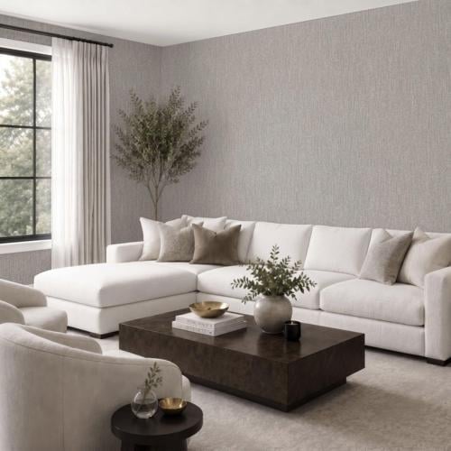
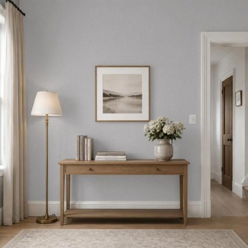
For interiors that need to remain bright and understated, Light Gray Wallpaper can provide a subtle alternative to white.
Light gray works particularly well in living rooms, bedrooms, hallways, and home offices where the objective is to maintain an open atmosphere while adding slightly more definition to the walls.
It also provides a versatile background for artwork and furniture.
Unlike bright white, which can create strong contrast, pale gray tends to soften transitions between different materials and colors. This can make the entire room feel more cohesive.
Light gray is especially effective when paired with oak, cream textiles, pale stone, brushed metal, or muted pastel accents.

Texture Prevents Neutral Walls From Feeling Flat
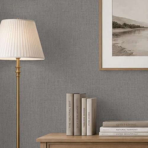
When a room uses a restrained palette, texture becomes more important.
Plain wallpaper does not need a visible decorative pattern to create interest. Fine linear details, textile-inspired surfaces, crosshatch effects, and other subtle textures can change the way a solid color interacts with light.
From a distance, the wall remains calm and monochromatic. Closer inspection reveals additional depth.
This approach works particularly well in premium interiors, where visual quality often comes from materials and finishes rather than excessive decoration.
A textured gray surface can therefore feel more architectural and considered while retaining the flexibility of a solid color.

Create Depth Through Tonal Layering
One of the most effective ways to design with gray is to combine several related shades.
Light gray walls can be paired with medium-gray upholstery and darker accessories. Alternatively, a deeper wall color can be balanced with pale furniture, rugs, and curtains.
The room remains largely monochromatic, but variations in tone create separation between individual elements.
Texture can strengthen this effect further.
Wool, linen, stone, wood, glass, leather, and subtly textured wallpaper all respond differently to light, helping a limited color palette feel layered rather than repetitive.
Make a Stronger Statement With Dark Gray
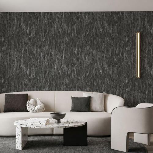
While pale gray creates a quiet foundation, Dark Grey Wallpaper can introduce greater depth and architectural impact.
Charcoal, graphite, and other deep gray tones work particularly well in rooms where a more intimate or dramatic atmosphere is desirable.
A dark gray wall behind a bed can visually anchor a bedroom. In a dining room, deeper walls can create a sophisticated background for statement lighting. In a home office, charcoal tones can make shelving, artwork, and lighter furniture stand out.
Dark gray does not necessarily make a room feel small.
The result depends heavily on lighting, furniture, and contrast. Pale upholstery, warm wood, metallic details, and strategically placed lighting can prevent deeper walls from feeling heavy.

Combine Light and Dark Gray
Light and dark gray do not have to be treated as separate design directions.
Used together, they can create a sophisticated tonal interior.
For example, a darker feature wall can be balanced by lighter gray surfaces elsewhere in the room. Pale gray walls can also provide a backdrop for charcoal furniture or cabinetry.
The contrast is softer than black and white but still provides enough definition to give the space structure.
This approach is particularly suitable for modern interiors where the goal is visual depth without introducing multiple strong colors.

Add Warmth With Natural Materials
One of the simplest ways to soften gray is through natural materials.
Light oak can make cooler gray feel more relaxed, while walnut creates a richer combination with medium and dark tones.
Stone is another natural partner. Marble, limestone, concrete-inspired finishes, and other mineral surfaces can reinforce the architectural quality of gray.
Textiles provide softness.
Linen curtains, wool rugs, upholstered furniture, and tactile cushions prevent an interior dominated by gray and hard materials from becoming overly austere.
The balance between these surfaces often matters more than adding additional colors.
Pay Attention to Lighting
Gray changes noticeably depending on lighting conditions.
Natural daylight may reveal undertones that are difficult to see in a small sample, while artificial lighting can make the same wall appear warmer or cooler.
Light gray can look almost white in a bright room but considerably deeper in a north-facing space. Charcoal may appear dramatic during the day and much softer under warm evening lighting.
Texture also interacts with light.
Subtle surface details can produce small shadows and variations that make a plain wall appear more dimensional.
For this reason, color, texture, and lighting should be considered together when creating a tonal interior.
Let the Details Define the Space
A refined gray interior does not depend on elaborate decoration.
Its character comes from the relationship between tone, texture, materials, furniture, and light.
Pale gray can provide a quiet alternative to white, while charcoal and graphite create stronger architectural definition. Used together, different gray tones can establish depth without disrupting the calm quality of a neutral palette.
This makes gray particularly suitable for modern premium interiors where understated design is intentional. Instead of competing with furniture, art, or natural materials, the walls become a sophisticated foundation that allows every carefully selected detail in the room to stand out.
(0) comments
We welcome your comments
Log In
Post a comment as Guest
Keep it Clean. Please avoid obscene, vulgar, lewd, racist or sexually-oriented language.
PLEASE TURN OFF YOUR CAPS LOCK.
Don't Threaten. Threats of harming another person will not be tolerated.
Be Truthful. Don't knowingly lie about anyone or anything.
Be Nice. No racism, sexism or any sort of -ism that is degrading to another person.
Be Proactive. Use the 'Report' link on each comment to let us know of abusive posts.
Share with Us. We'd love to hear eyewitness accounts, the history behind an article.