
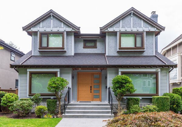
Certain houses carry an immediate sense of polish, even without grand entrances, elaborate stonework, or obviously costly architectural features. The entire building looks considered. That distinct visual impression comes from how smaller details interact with one another. Materials complement each other, window trim fits the scale of the facade, and entrance lighting suits the building's proportions. Gutters, vents, and hardware sit quietly in the background. Nothing feels accidental. Refinement develops by building stronger connections among existing elements rather than adding extra features.
Establishing Visual Hierarchy
A refined home exterior rarely forces multiple materials to compete for center stage. Brick, stone, siding, wood, metal, and painted trim can share a facade, but the strongest designs rely on a clear order of importance. One or two materials lead the look, while secondary options offer definition or contrast.
Because siding often covers the largest share of a visible facade, residential siding replacement can have a significant impact on the overall composition of a home. The color, profile, and texture of the new siding influence how the roof, masonry, windows, and surrounding trim are perceived. On some homes, siding works best as a quiet backdrop that allows stronger architectural features to stand out. On others, it provides the main source of texture and visual character. Giving every material a clear role helps the entire exterior feel more intentional and cohesive.
Getting the Trim Proportions Right
Trim does much more than cover raw edges around doors and windows. It defines the visual proportions of the whole exterior wall.
Trim that is narrow tends to wash out on a large home, leaving window openings looking isolated or undersized. Heavy, wide trim can produce the opposite problem, making windows appear boxed in and bulky. Finding the right proportions depends heavily on the home's architecture. Contemporary houses call for clean, quiet detailing. Traditional homes can accommodate thicker framing around windows, corners, and rooflines.
Consistency across the facade keeps these elements grounded. When window frames, corner boards, fascia, and door trim share the same design language, the building feels like a single unified design rather than a collection of separate projects.
Integrating Windows into the Architecture
High-quality windows alone cannot guarantee a cohesive home exterior. The placement of windows within the exterior wall shapes the final look as much as the window glass.
Frame colors, trim width, spacing, and transition points between materials all shape the final result. Even impressive windows look awkward if the trim surrounding them feels incomplete or mismatched. Evaluating an elevation requires looking at the big picture. Frame colors should connect logically to the roofline, doors, or metal accents. Trim needs enough width to hold its own without crowding the glass. Treating similar windows in a consistent manner sets a steady visual rhythm across the entire facade.
Choosing Lighting Based on Scale
Selecting exterior lighting often turns into a search for appealing fixtures, but scale influences the outcome far more than decorative details.
Tiny light fixtures placed next to a tall, wide front door can make a substantial home look incomplete. Excessively large lanterns do the reverse, overpowering the door frame and drowning out nearby architectural details. Matching light fixtures to the dimensions of the doorway, porch, and surrounding wall space keeps things in balance.
Metal finishes play a helpful supporting role here. Repeating a finish found on door handles, railings, or nearby metal trim creates subtle visual harmony. Light output requires equal thought. Warm, controlled lighting near entryways and walkways creates a welcoming look without overwhelming the neighborhood with glare.
Building a Clear Entrance Focal Point
An inviting front entry does not need excessive decoration. Restraint often gives the space significantly more presence.
A well-proportioned door, solid hardware, properly scaled lighting, and easy-to-read house numbers provide all the structure an entrance needs. Potted plants or subtle seasonal touches can support that arrangement without taking it over.
Clutter tends to build up when extra items get added to force a sense of personality. Layering multiple signs, mixing mismatched metal finishes, and packing the porch with accessories dilutes the main visual focus. A strong entrance relies on one clear idea working without distraction.
Refining Material Transitions
Transitions between different building materials represent some of the most telling details on a house exterior.
Points where siding meets stone, where a wall rests against the foundation, or where casing wraps a window frame reveal whether the design was fully planned out. Messy or awkward transition lines can make expensive building products look cheap. Clean, carefully executed junction points make standard materials look tailored and deliberate.
This becomes especially noticeable on facades featuring multiple finishes. Using clean termination points, maintaining straight sightlines, and changing materials at logical architectural boundaries keeps the facade from looking fragmented.
Handling Functional Features
Every house carries practical components that serve utility roles rather than aesthetic ones. Gutters, downspouts, exhaust vents, air units, utility meters, security cameras, and cabling all have necessary jobs to perform.
These practical features cause visual problems when they catch the eye first. A bright downspout running down a front wall slices the facade in half. A misplaced vent disrupts an otherwise balanced wall segment. Utility hardware clustered near an entrance creates visual noise right where guests look first.
Hiding every single utility item is neither realistic nor necessary. The goal is organizing these components through smart placement and painted finishes that match surrounding walls. Good exterior design plans for necessary functional equipment instead of ignoring it.
Aligning Landscaping with Architecture
Landscaping helps ground a house in its surroundings, but plants should never fight the building for attention.
Overgrown bushes near the foundation can hide key windows and decorative trim. Tall shrubs planted directly in front of main architectural features break up the facade's balance. On the other side of the spectrum, sparse landscaping leaves a well-built home looking bare and disconnected from the lot.
Plant selection works best when scaled to the height and width of the home. Low-growing shrubs keep sightlines open around windows and doors, while taller plants can soften large stretches of blank siding. Repeating a few select plant species creates a far calmer look than filling beds with a wide variety of uncoordinated greenery.
Practicing Design Editing
The instinct to make a house look more refined often leads to adding more features.
Homeowners frequently consider adding extra textures, bold accent materials, dramatic lighting setups, or decorative trim pieces. Yet the most striking homes often use the opposite tactic. Their appeal comes from thoughtful editing.
Limiting the material palette allows the home's shape and structure to stay visible. Sticking with consistent finishes creates continuous flow. Clean junctions keep the eye moving across the exterior. Properly proportioned features establish presence without competing for attention. Exercising restraint gives every chosen detail more weight and purpose.
Harmonizing Exterior Details
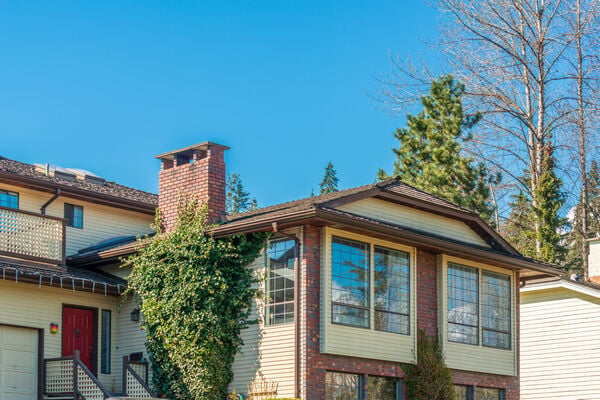
No single product or material instantly transforms a house exterior.
Refinement stems from dozens of quiet connections across the facade: how siding sits against masonry, how trim frames a window, how fixtures flank an entrance, how plants frame the structure, and how practical items blend into the background.
When these details support one another, the whole exterior feels complete and intentional. When they clash, even high-end materials lose their visual value. For homeowners preparing to update their home, evaluating how current elements relate to each other provides a solid starting point. Often, the most effective improvement involves making existing details work together as a single cohesive unit.


(0) comments
We welcome your comments
Log In
Post a comment as Guest
Keep it Clean. Please avoid obscene, vulgar, lewd, racist or sexually-oriented language.
PLEASE TURN OFF YOUR CAPS LOCK.
Don't Threaten. Threats of harming another person will not be tolerated.
Be Truthful. Don't knowingly lie about anyone or anything.
Be Nice. No racism, sexism or any sort of -ism that is degrading to another person.
Be Proactive. Use the 'Report' link on each comment to let us know of abusive posts.
Share with Us. We'd love to hear eyewitness accounts, the history behind an article.